It took one painful week of cutting, mounting, pinning and stressing but my Monster Quest exhibition is now up and finished, ready for the degree show.
I am very pleased with the result, as is my mentor Julia. There have been many positive comments from people already and I think it will push people to think of their own exhibition ideas for the display cabinet next year. Plus it has filled the dark empty void of what it was before.
It has been a very tough but enjoyable project and I will keep going with it, since there are many things I could do with the idea. Please do pop up to the animation floor and see it if you can!
Thursday, 7 June 2012
Wednesday, 16 May 2012
The last push! Images being printed.
I had a final cut off date for my images today. I managed to get 13 images finished altogether, which is roughly the amount I was aiming for. I am very pleased with all of my images, they are not perfect but they are good enough for me at this moment in time and they reflect my development and the fun I had on the project.
I will give a little run down of some of the new images and old ones I have edited:
I will give a little run down of some of the new images and old ones I have edited:
I had taken a nice little picture of this alleyway in Bristol and thought it might be nice to have monsters poking their heads out of each little doorway on either side. I then noticed that there was a sign for a barbershop. Julia suggested that I give the monsters whacky haircuts and so this was created. I added lens blur to the closest monster so it fits with the image.
I couldn't resist placing a monster onto this wrecked car, it seemed so obvious to do so. I think he may be slightly too bright but I wanted to be bold with these images so I have to be daring.
I hadn't tried turning actual humans in the photos into monsters yet and I thought I would try it out on this picture of Dan fighting against the wind with his umbrella. It started to fit perfectly as I made the umbrella a nasty monster fighting him. I actually think that this monster has some of Dan's personality.
This is my favourite of the bunch because I feel as though these monsters have the most appeal. They are extremely cute, although I'm not sure how cute the mother would be if you got close to her young ones. I also really enjoyed placing a monster out of focus in the distance. In played around with blurs and mist to get it to look right.
This was an idea that me and Julia came up with when looking at the original photo. It was a great find, to get a picture of an odd little hideaway that had a stocks that I could shove a monster in. It was fun to actually make the monsters interact with the scenery, it gives them more purpose than some of the others.
I edited this image slightly as even though I liked the subtlety of it, I felt that for an exhibition it needed more impact. It only took an addition of one extra bright monster peering out from behind a building to spice it up. I would like to try adding in more monsters but it could spoil it.
I was really pleased with this image, it was the first one where I made a part of the scenery into a monster. This skip seemed perfect for it considering its placement in the photo and the brightness of its colour. I tried to make the arms look like toxic sludge. I think its one of the stronger images in the set.
I posted this image before but realised it needed more done to it. Just the one monster wasn't enough and so I decided to play around with placing more monsters in it. Julia suggested playing with the reflections and it seemed nice to have a monster that is out of shot but you can see his reflection in the puddle and just his hand creeping into frame. There's also a cheeky one popping his head over to have a look at what is going on.
Here is the completed monster that I wanted to live under these stairs next to the trolley, I added in a little home sweet home sign. I think I managed to get the shadow right.
Wednesday, 9 May 2012
One week left!
After another review with Julia yesterday afternoon, it was decided that since the pictures have been taking a lot longer to make than expected and I could push them even further, I have allowed myself another week to make a few more and get them all polished. So I need them all done by wednesday next week.
Julia liked my new found craziness to the images but we both felt that with a little bit more time, I could improve the staging in some of them and go crazy with some more photos.
For example, in this image below I want to add in a few more monsters in the background, and maybe add a reflection of a monster in the left hand-side puddle so that we know there is another monster just out of the shot.
I also got talking about the potential of other images and the ideas started to develop towards giving these monsters more of a story and more purpose. We came up with the idea that the grotty places I photographed in the city could be like a paradise to these creatures. They could be pictured in these photos like they are in their homes or on holiday there. For example in this photo below I wanted to make this little spot under the bridge like a home to this bug like creature. He has made it into a cosy are with pictures hanging up and he is feeding off of the rubbish bins. Here is the photo with a sketch of the intended character:
I will try and search for funny framing in family holiday photos and try to incorporate some of that into my designs. I hope to have about 12 - 15 images altogether by the end of this project.
Tuesday, 8 May 2012
Speeding up the process.
As I've been producing more and more of these monster pictures I have been learning new ways to make them look good but also make the process faster. I started off with the usual proceedings of drawing a monster on the photo digitally, then drawing it out properly on paper to be scanned back in and painted over. However I found that even though it looked nice, traditional style painting in photoshop was very time consuming and it was taking me ages to get a texture that I was pleased with.
Here is one of my monsters with painted texture:
Here is one of my monsters with painted texture:
I decided to see if there was another way I could get a nice texture without it taking so long. I started to play around with painted colours on watercolour paper and then scan them into photoshop:
I then brought a texture square into a picture I was working on in photoshop and overlaid it on top of a layer that contained the shape of my monster, cut it out to fit the shape using the magic wand tool and then I just lowered the opacity so that it blended with the colour of the shape underneath:
I could then still add shadow and highlights on top and the monsters started to look a lot rougher and monster like. The final result ended up looking a lot like this:
I will continue to experiment with different textures, using anything I can find and rubbing it on paper and playing with it in photoshop. I think the way to go with this is to just be rougher and quicker with these pictures, sticking to bold shapes and simple staging.
Thursday, 3 May 2012
More inspiration.
Dave Cooper is a little gem of an artist that I found out about recently when I picked up his book 'Bent' in a comic store.
His work is a amalgamation of everything I love in illustration. He utilises the "rubber hose" and cute wide-eyed style of early animation, and stretches it, pokes it, puts it through a black hole and throws it back onto paper and is left with wickedly surreal worlds and characters. Its like looking at Betty Boop while on some psychedelic trip!
His work is a amalgamation of everything I love in illustration. He utilises the "rubber hose" and cute wide-eyed style of early animation, and stretches it, pokes it, puts it through a black hole and throws it back onto paper and is left with wickedly surreal worlds and characters. Its like looking at Betty Boop while on some psychedelic trip!
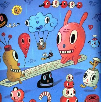
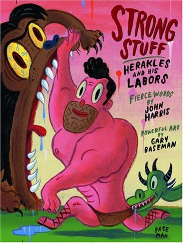
I have also always admired the work of artist and designer Gary Baseman, who also uses a cute, big-eyed character style reminiscent of early animation and cartoons but makes them rather evil and scary at the same time. His experimentation with shape and colour is phenomenally eye-catching and his work is instantly recognisable! I need to start incorporating more of this energy into my creatures and illustrations.
Rethinking.
I had a meeting with Julia today to discuss the exhibition and direction of the work and I had originally come up with the idea of laying out the space like this:
I was to have the map of Bristol in the middle as a centrepiece with all of the monsters and their locations pinned on it and it would then be surrounded by the prints of my photos. The large photos would be at the top with smaller prints underneath. There would be a poster in the middle above the map and running along the bottom of the space would be the 3D props/artefacts I have created. After speaking with Julia about this layout, she pointed out that it seemed a little bit regimented and I agree. Looking at it now, the structured layout could dampen the bold, crazy nature of the ugly monster subjects in the work and it may be a lot nicer to focus on the actual work having some really big prints surrounding map and move the title down running along the bottom. It may also be an idea to remove the props, or maybe leave a few, but focus on having more sketches/monster pictures of a smaller size scattered along the bottom. This is something that I will have to think about and play with once the work is all done and see what works best, my main goal is to draw people in and have an impact.
I also discussed the actual work/illustrations I have been doing with Julia and she liked what I had come up with but felt that the monsters were a bit subtle at the moment and she knew that I could be a lot more garish and create something that shows off the nature of some of my influences and sketchbook work. I personally like the subtlety in the pictures I have been making but I think that for the purposes of an exhibition I do need to be a lot more daring and show off with bolder, louder and crazy designs. She suggested that I extend the project until Tuesday and experiment and alter the work more to achieve a more striking effect. This is great for me because at the moment I don't feel as though it would be the great display I think it has the potential to be. Here is a scan of my notes from the meeting with the suggested influences to look at.
Tuesday, 1 May 2012
Getting Better
As I have been creating more and more pictures in Photoshop, playing around and experimenting, I am becoming more confident. I had the idea of placing a giant sea monster in the water surrounding the Harbourside area. I was worried at first however that I wouldn't be able to make it look like it fit in with the environment in the picture and I had never really painted reflections before. But with a few filters and brush strokes in Photoshop it started to look a lot better and I was happy with the result.
Monday, 30 April 2012
FUN Inspiration TIME!
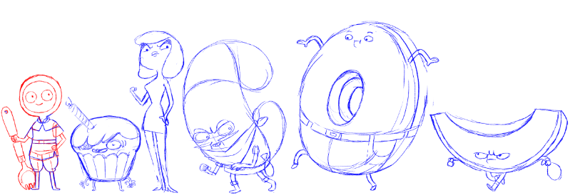
This is the work of an animator and character designer who I only know by his blog name: stepsoversnails.tumblr.com
His work is extremely playful, cute and eye-catching, I think that it always looks so appealing since he structures his characters with such simple shapes. He uses thin little legs and huge round circular bodies or heads and usually large cute eyes. I want this to inform my designs so they have more impact.

No other shows create monster designs as creative as Adventure Time do. They seem to get the perfect balance of cute and horror. The designs are really nice to look at and they are very experimental with their shapes and features on the characters. They will alter eyes and mouths and exaggerate everything to create bold imagery. Adventure Time will be one of the biggest influences on this project, especially since the two main characters always go on quests and find monsters.
Sunday, 29 April 2012
The process.
I'm currently trying to find a workflow that is best for me. I usually tend to draw better on paper or in my sketchbook first which is what I have been doing with these monster creatures, then scan them in. I then take the drawing and paint it digitally in Photoshop, maybe changing a few features of the design, then try and place my design into one of my photos.
Here is a rough example of the first two steps of this process:

However this process seems to prove a bit difficult as when I come to trying to place the monster into a photo I have to then edit it to make it fit in. I think I may have to end up extending the process so that I first get a photo up in photoshop, roughly draw a sketchy monster into it in a position I want it to be in. Then print that out and draw over it in pencil on paper so that the drawing is a lot nicer, then scan that back in to be painted and placed in a photo. It is a hell of a lot lengthier but I think that will ensure the work looks its best.
Here is a rough example of the first two steps of this process:

However this process seems to prove a bit difficult as when I come to trying to place the monster into a photo I have to then edit it to make it fit in. I think I may have to end up extending the process so that I first get a photo up in photoshop, roughly draw a sketchy monster into it in a position I want it to be in. Then print that out and draw over it in pencil on paper so that the drawing is a lot nicer, then scan that back in to be painted and placed in a photo. It is a hell of a lot lengthier but I think that will ensure the work looks its best.
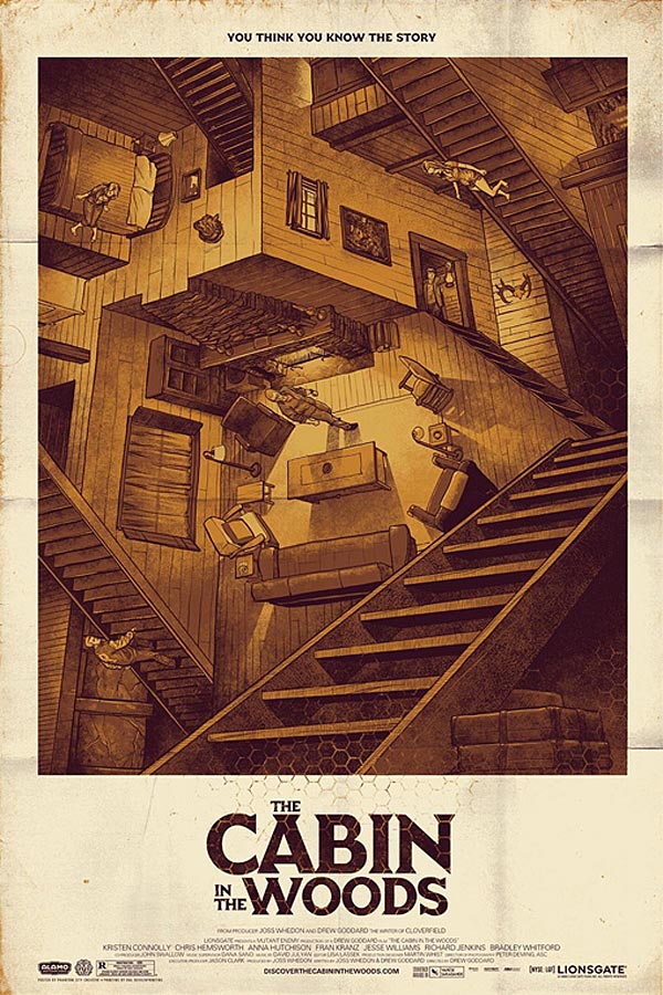
The Cabin in the Woods!
I went to see 'The Cabin in the Woods' yesterday and even though it didn't live up to the hype surrounding it, it was one of the best horror films that has come out in a while considering that, in my opinion the horror genre has become so unoriginal and stale as the years have gone on.
It related really well to the project I am working on at the moment, not just because it was a horror movie but because it referenced horror and played with it. Now this has been done before, with such films as 'Scream' and 'Scary Movie' but where I think this film showed more originality was in the moments where it played with the idea of all the different monsters/mythical creatures that are in horror. The victims were being played like puppets from a control room and you found out that in this control room they have a large amount of different monsters such as zombies, werewolves, merman and many others, they even went as far as a killer unicorn! In one really memorable scene all of these monsters were accidentally let out of their cells into the control centre and started killing everyone in their own unique ways. There were zombies eating people, a clown stabbing, killer robots sawing and a small girl in a ballet costume with a face full of teeth!
The costume and design of these creatures was great and you could tell they had fun with it. This was some great inspiration!
Thursday, 26 April 2012
Rainy Adventure: Gathering materials.
I have decided that regardless of whether it is pouring down, I will get my photos. I ventured out into the downpour to get some great shots in the city, whipping the camera out every time the rain decided to hold off for a few minutes. The result was some lovely moody photos in a few nice little spots that would be great to put monsters into.
I have made a little test/mock-up of what one image may look like. A troll under one of Bristol's bridges!
I have made a little test/mock-up of what one image may look like. A troll under one of Bristol's bridges!
It will be a lot more detailed however when I map it out properly and design the characters in more detail.
On my travels I also found a great new art shop in the town centre. It was called Crafts and More and it had three floors of great supplies! I founds lots on materials that I could use to make my 3D objects with! For example I found polystyrene shapes that I could paint and turn into a monster skull, or eyeball or maybe a glowing monster tooth! I will also be painting monsters onto this small map of Bristol that I bought as if its my adventurer's map with the locations of all the monsters/objects on it!
Monday, 23 April 2012
Narrowing it down.
I have begun to narrow down the theme ideas for the exhibiton:
'They Only Come Out At Night' This was the idea that I went out in the city and surrounding residential/park areas and took photos at night. I would then place disgusting and creepy creatures within the photos with real people/models running away from them. However this could be a difficult one to work with as photography at night can be hard to do without blurriness or a drop in quality.
'Into the Woods' Was one of my first ideas for this project. It would involve going into the woodland area surrounding Bower Ashton and take photos and then place monsters/creatures amongst the trees. Maybe incorporate cardboard masks and have the creatures' heads made out of cardboard and displayed next to the photos as if they have been killed and then taken inside as a trophy. However I do feel that this does limit me a bit as the whole set of work will look too similar and just seeing lots of trees might become a bit stale after a while.
'QUEST' I have always been a huge fan of role-playing and the mythology behind monsters has a lot to do with adventure and quests. I had this idea of expanding the idea of monster hunting in the woods and making it a city wide hunt, maybe based on a map of Bristol with different locations that I had to adventure to and slay a monster. This opens up a lot more possibilities as I could make the exhibition look like a cabinet of findings from my quest and, as well as monsters heads, actually make small objects/prizes that I retrieved from each small expedition. For example, travel to one of the city's bridges, defeat the troll and bring back its skull! Then document it in photos and make a cardboard skull to display next to it in the cabinet.
These are my ideas and I'm most excited about the 'Quest' idea. I will be going out and starting to make some imagery. Time is becoming a bit tight however since the weather hasn't really been on my side with the constant rain making it impossible to go out and take pictures for long periods, let alone taking cardboard pieces out into the location which would get ruined very quickly!
Sunday, 22 April 2012
Deciding on a theme.
I have been trying to come up with ideas for a theme for my project.
I made a small brainstorm and found that a lot of things I wanted to have in the project actually all link up quite well.
I wanted to use the idea of putting stylistic monsters into real photography but make it part of a bigger picture. I started brainstorming and found that there is a large sense of adventure related to monster fiction and I started to link my ideas to possible overall themes/titles.
Sunday, 15 April 2012
The Count!
Planning on making a set of these ink on watercolour paper illustrations of monsters to maybe enlarge and put on display. This is the Count!
David Shrigley Exhibition
I went to the David Shrigley and Jeremy Deller Exhibiton at the Southbank Centre in London. It served as great inspiration for this project as I am now going in the exhibition direction.
The Deller exhibit had some great pieces, large iconic typography and pop culture photography, along with a large interactive room which was great to walk through.
However Shrigley's display happened to resonate more with me and my own personality. He uses the gallery space in a way which is very unique. He sees it as a playground, a blank space to make into his own funhouse. He leads the audience to look out of windows to only find one small stickman standing out there on the balcony. Also it was nice to see small animated loops incorporated into the space, scattered everywhere, amongst oversized keys and funny little sculptures. I want to take some of his quirkiness and implement it into my exhibition, rethink how I will use the limited space I have so that I have something more than just prints. I want to draw attention to it and certain pieces, I don't want people to just glance and then pass on.
I have scanned a little Shrigley inspired doodle I made on the way home.
Wednesday, 11 April 2012
New Direction (yet again)
After a breather from the project it seems as though it doesn't hold as much excitement for me anymore. I really like the idea of a book but the idea of the narrative and story seems as though it may limit me and my creativity. I still want to work with monsters but I feel as though keeping to one style and story throughout would become a bit stale and my development as an artist/designer would become a bit restricted.
I had an interesting chat with my tutor Julia Bracegirdle today and she propositioned me an interesting little project. I am to create an exhibition for the campus studio corridor that showcases my design work with an overall theme. I showed her my current project and she loved my creature design and suggested going in that direction.
I have found some great inspiration already for exhibition ideas;
 |
| Aaron Stewart adds little monsters digitally into retro photos. www.plaidoranges.com |
 |
| Aaron Leighton adds little creatures into city pictures. http://www.aaronleighton.com |
 |
| UK based illustrator Joe List incorporates this theme into his work. www.freakleap.co.uk |
 |
| Saul Steinberg's photos of people with cardboard masks. |
With the help of Julia I came up with an idea of photography of these creatures in the wild, in locations such as the woods near Bower Ashton Campus or places in the city such as factories and waste disposal areas but then displaying their cardboard heads on plaques next to the photos like trophies as if they had been hunted.
The deadline is the 2nd of May, and I aim to get all of the work made by the 30th so that I have about a few days sorting out what I will display and getting all the printing done.
I will now work with some styles and designs and try and come up with an overall theme.
Here is a small illustration I made that I thought could be a nice starting point for style.
Went to Lisbon
Hello,
Sorry that there hasn't been a post in a while. I went to Lisbon for an animation festival! It was MONSTRA 2012 and I saw some really great films and many really bad films. Saw some great animated teasers for the festival involving monsters, which was great for my personal project theme!
I have some sketchbook pages from lisbon to show:
Then visual culture happened... which was good in a way because I got to read up about zombies and watch zombie films for a whole week while writing about them in a lot of depth. It all works as inspiration to this project I guess.
The Nickelodeon project didn't materialise since the people I wanted to work with were both too busy and it wasn't going to get done before the deadline. But it was a nice little exercise to sketch out designs and ideas anyway.
Now that is out the way I have had time to concentrate on my project again. It has been good to get away from it so I now have a fresh pair of eyes to go back over it!
Subscribe to:
Posts (Atom)


